Introduction and overview
1 How to write
1.1 Synonyms
Use this dictionary while practicing IELTS Writing Task 1 to improve vocabulary variety and precision. Ideal for all chart types: bar, pie, line, table, map, and process.
1.1.1 Verbs for “Show” / “Display”
| Common Word | Synonyms / Variants |
|---|---|
| show | illustrate, depict, present, demonstrate, display, represent, exhibit, outline, provide information about, give data on, compare, highlight |
1.1.2 2. Nouns/Verbs for “Change”
| Type | Synonyms |
|---|---|
| increase (noun) | growth, rise, climb, surge, upswing, escalation |
| increase (verb) | rise, grow, climb, go up, surge, escalate, shoot up |
| decrease (noun) | drop, fall, decline, reduction, downturn, dip, decrease |
| decrease (verb) | fall, drop, decline, decrease, plummet, go down, shrink, dip |
1.1.3 3. Synonyms for “Proportion / Percentage”
| Common Word | Synonyms |
|---|---|
| proportion | share, fraction, segment, slice (pie charts), distribution, ratio |
| percentage | rate, level, portion, figure |
| small | minor, limited, modest, negligible |
| large | major, significant, considerable, substantial |
1.1.4 4. Synonyms for “Types / Sources / Categories”
| Common Word | Synonyms |
|---|---|
| sources | types, kinds, categories, forms, classes, groups |
| kinds | categories, sorts, varieties, classifications |
1.1.5 Synonyms for “People / Groups / Users”
| Common Word | Synonyms |
|---|---|
| people | individuals, users, participants, members of the public, citizens |
| men | males, male individuals |
| women | females, female individuals |
| users | consumers, participants, clients, visitors |
1.1.6 Synonyms for “Place / Region / Country”
| Common Word | Synonyms |
|---|---|
| place | area, region, location, zone, territory |
| country | nation, state |
1.1.7 Verbs for Time & Trends
| Phrase | Alternatives |
|---|---|
| remained steady | stayed constant, was stable, showed little change, levelled off |
| fluctuated | varied, shifted, was inconsistent, experienced ups and downs |
| peaked | reached a peak, hit the highest point, soared to a maximum |
| bottomed out | fell to a low point, reached the lowest level, dipped to its minimum |
1.1.8 Describing Time Periods
| Phrase | Synonyms / Alternatives |
|---|---|
| in 2000 | in the year 2000, during 2000 |
| between 2000 and 2020 | from 2000 to 2020, over the 20-year period |
| over time | over the years, across the period, throughout the timeline |
1.1.9 Synonyms for “Number / Amount / Quantity”
| Common Word | Synonyms |
|---|---|
| number | figure, total, count, value |
| amount | volume, extent, level, quantity, load |
| a lot of | many, numerous, a high number of, a significant number of |
| a few | some, several, a small number of, a limited amount of |
1.1.10 Task-Specific Vocabulary
1.1.11 📈 Line Graphs
- increased gradually → rose steadily
- dropped sharply → declined dramatically
- fluctuated slightly → experienced minor variations
- showed an upward trend → followed a rising pattern
1.1.12 📊 Bar Charts
- highest value → peak, top point, maximum
- lowest value → minimum, bottom value
- category → group, classification, segment
1.1.13 🥧 Pie Charts
- slice → segment, portion, share, fraction
- largest share → dominant proportion, biggest segment
- equally distributed → evenly divided, shared equally
1.1.14 🗺️ Maps
- built → constructed, developed, established
- removed → demolished, cleared, replaced
- added → introduced, expanded, inserted
- turned into → converted into, transformed into
1.1.15 ⚙️ Process Diagrams
- step → stage, phase, level
- begin → commence, initiate, start with
- end → finish, conclude, result in
- goes through → undergoes, passes through, transitions through
1.2 Academic vocabulary
1.2.1 Understand Meaning & Use
| Phrase | Meaning | Example Sentence |
|---|---|---|
| strong preference | clearly like one thing more than others | Male students showed a strong preference for engineering. |
| more inclined toward | tend to choose or favor something | Female students were more inclined toward education. |
| relatively balanced | nearly equal or similar | Participation in social sciences was relatively balanced between genders. |
1.2.2 Make Your Own Sentences
- I have a strong preference for studying at night rather than in the morning.
- Teenagers today are more inclined toward using smartphones for entertainment.
- The use of bicycles and cars in this city is relatively balanced.
2 Practice
2.1 Rewrite Introduction
2.1.1 Rewrite
The table shows how many hours people of different age use internet for fun and for work each week. My answer: The table illustrates the number of hours people of various ages use the internet for leisure and for professional each week.
| Issue | Explanation | Correction |
|---|---|---|
| “for professional” | “Professional” is an adjective. You need a noun here. | Use “for work” or “for professional purposes” |
| “people of various ages” | Good, but can be made more natural. | Try “people in different age groups” |
| “use the internet” | Fine, but could be made more academic. | Try “spend online” or “use the internet for…” |
| Word order | Ending on “each week” is okay, but it reads better earlier. | Rearrange for fluency. |
Better: The table illustrates the number of hours per week that people in different age groups spend online for leisure and work-related activities. Or: The table provides data on the weekly hours spent online by people of various age group, categorized by leisure and professional purposes.
Rewrite: The bar chart shows the percentage of households in four different income levels that had internet access in 2010 and 2020. I write: The bar chart illustrates the distribution of households in four various income levels that had internet access in 2010 and 2020.
| Issue | Correction |
|---|---|
| “four various” | ❌ Redundant. Use either “four” or “various” — not both. → ✅ “four different” or just “four” |
| “distribution of households” | ✅ Okay, but could be clearer — this chart shows percentages, not the count or physical distribution. Try “percentage of households” |
| Grammar and flow | Sentence is understandable but can be more formal and concise |
Better: The bar chart illustrates the percentage of households across four income levels that had access to the internet in 2010 and 2020. Or: The bar chart compares the proportion of households with internet access in four income groups for the years 2010 and 2020.
2.1.2 Rewrite
The line graph shows the number of international students enrolled in Canadian universities between 2005 and 2020, broken down by region of origin.
The line graph illustrates how many international students enrolled in Canadian universities between 2005 and 2020, categorize by area of origin.
| Issue | Explanation | Correction |
|---|---|---|
| “how many international students” | Okay, but more formal: “the number of international students” | |
| “categorize” | ❌ Wrong form → should be “categorized” (past participle in passive structure) | |
| “area of origin” | Acceptable, but “region of origin” or “by region” is more common in academic writing | |
| Flow | Combine ideas more smoothly with a formal tone |
Better: The line graph illustrates the number of international students enrolled in Canadian universities from 2005 to 2020, categorized by region of origin. Or: The line graph presents data on international student enrollment in Canadian universities over a 15-year period, broken down by region of origin.
2.1.3 Rewrite
The pie charts show the proportion of energy produced from five different sources in a European country in 1980 and 2020. I write: The pie charts illustrate the percentage of energy made from five different sources in a European country in 1980 and 2020.
| Issue | Explanation | Fix |
|---|---|---|
| “energy made from” | ❌ Informal/awkward for Task 1. Use “produced from” or “generated by” | |
| “in a European country” | ✅ This is fine and accurate | |
| “five different sources” | ✅ Good — “five sources” is enough, but “different” is okay for emphasis |
Better: The pie charts illustrate the proportion of energy generated from five sources in a European country in the years 1980 and 2020. Or: The two pie charts compare the share of energy production by five distinct sources in a European country in 1980 and 2020.
2.1.4 Rewrite
The table displays the average monthly income (in USD) for workers in three different sectors in five countries. I write: The table illustrates the salary of workers in three different sectors in five countries.
| Issue | Comment | Suggested Fix |
|---|---|---|
| “illustrates” | ✅ Good verb for visuals | |
| “the salary” | ❌ Slightly vague → “salary” is better expressed as “average monthly income” to match the task | |
| “three different sectors” | ✅ Fine, though “various sectors” or “economic sectors” may be more formal | |
| “in five countries” | ✅ Good — you could also say “across five countries” for variety |
Better: The table illustrates the average monthly income of workers across three sectors in five different countries. Or: The table presents data on the average monthly earnings of employees in three occupational sectors across five countries.
2.1.5 Rewrite
The line graph shows the percentage of the population aged 65 and over in Japan, Sweden, and the USA from 1940 to 2040. I write: The line graph illustrates the proportion of the people who over 65 and over in Japan, Sweden, and the US between 1940 and 2040.
| Issue | Explanation | Fix |
|---|---|---|
| “the people who over 65 and over” | ❌ Grammar mistake. You need: “people aged 65 and over” | |
| “the proportion of the people” | ❌ Too wordy. Use “the proportion of people” (no “the” before “people”) | |
| “US” vs “USA” | ✅ Both are fine. Choose one and stay consistent | |
| “between 1940 and 2040” | ✅ Correct and clear |
Better: The line graph illustrates the proportion of people aged 65 and over in Japan, Sweden, and the USA between 1940 and 2040. Or: The line graph compares the percentage of the population aged 65 and above in Japan, Sweden, and the United States from 1940 to 2040.
I write overview:
While the number of USA senior citizen is slightly increase in throughout the period, that figure of Sweden and Japan are reduce on that time.
| Issue | Explanation | Correction |
|---|---|---|
| “number of USA senior citizen” | ❌ Wrong form: should be “percentage of senior citizens in the USA” | |
| “is slightly increase” | ❌ Incorrect verb form: should be “increases slightly” | |
| “are reduce” | ❌ Incorrect verb form again: should be “decline”, but actually this is factually wrong | |
| Trend accuracy | ❌ In fact, Japan and Sweden both increase overall, not decrease |
Better: Overall, the proportion of elderly people increased in all three countries throughout the period, with Japan showing the most dramatic growth after 2020. Or: In general, all three countries experienced a rise in the percentage of people aged 65 and above, with Japan’s elderly population rising sharply after 2020. ## Overview
An overview I write: Overall, it is clear that people spend the time on the internet for professional purposes most in their 20s, while their time for online leisure is largest when teens.
Better:
Overall, it is clear that internet use for work peaks among people in their 20s, while leisure-related usage is highest among teenagers.
Avoid exact figures
Focus on trends, not facts
Use comparative language: most common, highest, dominant, peak, etc.
2.2 Full paragraph 1

My write: The bar chart illustrates the number of people who spend time in Dover and Troy in 4 seasons. From an overall perspective, Dover has more people visiting in the two end seasons of the year, while Troy experiences a tourist trend in summer and fall.
| Issue | Problem | Suggestion |
|---|---|---|
| “who spend time” | Slightly vague — use more formal and precise phrasing | “who visited” or “who traveled to” |
| “in 4 seasons” | Informal and unclear | “across the four seasons” or “during spring, summer, autumn, and winter” |
| “two end seasons of the year” | Unnatural phrasing | Use: “in winter and autumn” or “in the colder seasons” |
| “tourist trend” | Vague expression | Use: “a peak in tourist numbers” or “more visitors” |
Better: The bar chart illustrates the number of tourists who traveled to Dover and Troy during the four seasons. Overall, Dover attracted more visitors in the colder seasons, while Troy saw higher tourist numbers in summer and autumn.
To express the upward seasonal trend of Dover tourism: - The number of visitors to Dover increases steadily from spring to winter. - Dover experienced a consistent rise in tourist numbers throughout the year. - In Dover, visitor numbers gradually grew across the seasons, peaking in winter. - Tourism in Dover followed an upward trend, with each season attracting more visitors than the previous one.
To overview: Overall, Dover experienced a steady increase in visitor numbers from spring to winter, while Troy attracted the most tourists during the summer and autumn seasons.
The pie charts below show enrollment in different fields of study at a particular university.
Summarise the information by selecting and reporting the main features, and make comparisons where relevant.  The pie charts illustrate the proportion of enrollment in various field of study at Clydesdale university categorized by gender. From an overall perspective, Men keen on engineering and social sciences, while women students like to study education and humanities.
| Issue | Problem | Suggested Fix |
|---|---|---|
| “various field of study” | Grammar: “field” → plural form | “various fields of study” |
| “at Clydesdale university” | Capitalization | “Clydesdale University” |
| “Men keen on…” | Missing verb and informal | “Men are more likely to enroll in engineering and social sciences” |
| “like to study” | Informal | “tend to choose” or “prefer to study” is more academic |
| “women students” | OK, but better phrased as “female students” or just “women” in context |
Better: The pie charts illustrate the proportion of students enrolled in various fields of study at Clydesdale University, categorized by gender. Overall, male students were more likely to choose engineering and social sciences, while female students tend to prefer education and humanities. Or: The two pie charts illustrate the percentage of male and female students enrolled in four academic fields - Social Sciences, Humanities, Education, and Engineering - at Clydesdale University. Overall, male students showed a strong preference for Engineering, while female students were more inclined toward Humanities and education. Notably, Social science was the only field with relatively balanced participation between genders.
The table below shows the number of hours per week people of different ages spend using the internet for different types of activities.
Summarize the information by selecting and reporting the main features, and make comparisons where relevant. Hours per week spent on the internet, by age
| teens | 20s | 30s | 40s | 50s | 60s+ | |
|---|---|---|---|---|---|---|
| studying/working | 15 | 50 | 45 | 40 | 40 | 17 |
| leisure activities | 20 | 18 | 17 | 10 | 11 | 18 |
my write: The table illustrates the hour per week people of various age range online for professional and leisure purposes. From an overall perspective, people spend their online time for professional soar up in 20s and decline while the figure of leisures activities down in their 40s.
| Issue | Error | Suggested Fix |
|---|---|---|
| Word form | “the hour per week” | Use plural: “the number of hours per week” |
| Word choice / grammar | “people of various age range” | Use: “people in various age groups” |
| Missing verb | “people… online for professional and leisure purposes” | Add: “spend time online for professional and leisure purposes” |
| Word choice / expression | “soar up in 20s” | Use academic tone: “peaks in their 20s” or “is highest in their 20s” |
| Verb form | “the figure of leisures activities down” | Correct form: “leisure activity time decreases” |
| Plural error | “leisures activities” | Use: “leisure activities” (uncountable noun) |
| Clarity | Sentence structure (2nd sentence unclear and rushed) | Split into two clear comparisons with linking phrases |
Better: The table illustrates the number of hours per week that people in different age groups using the internet for professional and leisure purposes. Overall, internet use for professional reasons peaks in the 20s and declines with age, while time spent on leisure activities falls in middle age but rises again in older groups. Other: The table displays the average number of hours per week that people across six age groups spend using the internet for two main purposes: studying/working and leisure activities. Overall, internet use for studying or working peaks in the 20s age group and gradually declines with age, while leisure-related usage remains more stable across age group, with only moderate variation. Notably, teenagers spend more time online for leisure than for academic or work purposes, in contrast to all other all groups.
| Criterion | Strength |
|---|---|
| Task Achievement | ✅ Fully covers the main trends without listing data. Clearly highlights a notable contrast (teens vs. others). |
| Coherence & Cohesion | ✅ Well-organized with smooth transitions (“Overall,” “Notably,” “in contrast”) |
| Lexical Resource | ✅ Sophisticated phrases: “remains more stable,” “moderate variation,” “peaks,” “gradually declines” |
| Grammar Range | ✅ Great range: passive, adverbs of degree (“gradually,” “more stable”) and parallel structures |
“Internet use for studying or working” → could be rephrased as “professional or academic purposes” in future writing for variation.
“Moderate variation” → you could vary this with “slight fluctuation” or “subtle differences”.
Rockingham, transportation
2005 work at home 10%, walk 5%, bicycle 5%, bus 15%, carpool 25%, car (alone) 50%. 2015 work at home 15%, walk 5%, bicycle 10%, bus 15%, carpool 20%, car (alone) 50%.
The pie chart illustrates the proportion of six types of transportation to work of employees in Rockingham in 2005 and 2015. Overall, although the decline in 2015, cars is still the highest proportion type of vehicle to work in two times, while bicycle and people work from home are likely increase.
| Issue | Error | Suggested Fix |
|---|---|---|
| Article usage | “the pie chart” (okay) but can be plural for 2 years | “The pie charts illustrate…” |
| Phrasing | “transportation to work of employees” | “commuting methods used by employees” or “transportation methods for commuting” |
| Grammar | “although the decline in 2015” (fragment) | “Although there was a decline in 2015,” |
| Subject-verb agreement | “cars is” | “cars remain” or “the use of cars remains” |
| Clarity | “the highest proportion type of vehicle” | “the most common mode of transportation” |
| Expression | “in two times” (unnatural) | “in both years” |
| Verb form | “are likely increase” | “increased” or “saw an increase” |
Fix
The pie charts illustrate the proportion of six types of transportation method for commuting in Rockingham in 2005 and 2015.
Overall, although there was a decline in 2015, the use of cars remains the most common mode of transportation in both years. Meanwhile, the proportions of bicycle use and working from home increased.
Other The two pie charts illustrate how employees in Rockingham commuted to work using six different transport methods in 2005 and 2015. Overall, although the proportion of people commuting by car alone remained the highest in both years, its usage declined slightly in 2015. At the same time, bicycle use and working from home became more common, while walking and bus usage remained stable.
| Purpose | Phrase Examples |
|---|---|
| Introduction | “The chart illustrates…” / “The graph presents…” |
| Overview intro | “Overall,” / “In general,” / “It is clear that…” |
| Showing contrast | “While…” / “Although…” / “By contrast…” |
| Highlight trend | “…remained the most popular” / “…saw a rise in…” |
“The chart below shows the percentage of households in different income groups that had internet access in a European country between 2005 and 2020.”
| Year | Low Income | Middle Income | High Income |
|---|---|---|---|
| 2005 | 10% | 40% | 75% |
| 2010 | 25% | 60% | 90% |
| 2015 | 40% | 75% | 95% |
| 2020 | 60% | 85% | 98% |
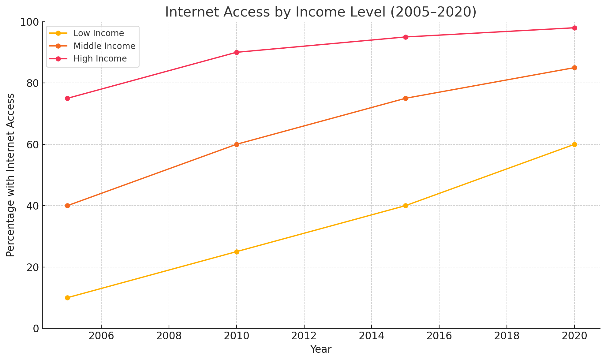
My write The chart illustrates the proportion of households various income group that had access to internet in a European country in 3 categories between 2005 and 2020. Overall, all those income group saw a increase in internet access. Meanwhile, Low Income group still have relatively low percentage of internet access comparing to middle income and high income.
People from highest income class began the period with already high percentage internet access, with 75% in 2005. After High Income class’s internet access saw a significant rose to 90% in 2010, their use of internet increased steadily to 95% in 2015 after end up with 98% in 2020.
The percentage of middle income’s internet access begin the period with 4 times the figure of low income people, with 40% and 10% respectively. The period from 2010 and 2015 experienced the rapidly growth from 60% to 75% of middle income and 25% to 40% of low income. Otherwise, in the end of the period, the proportion of middle income class using internet steadily went up to 85%, while that figure of low income group soared up to 60%.
2.3 🟩 Overall Band Score: 6.0
2.4 🟨 Coherence and Cohesion: 6.0
2.4.1 ✅ Analysis:
☑ Structure your answers in logical paragraphs
☑ One main idea per paragraph
☑ Include an introduction and conclusion (short summary provided at the beginning)
☑ Support main points with an explanation and then an example (some explanation is there but lacking clarity)
☑ Use cohesive linking words accurately and appropriately *(e.g., “overall”, “meanwhile”, “otherwise”)
❌ Vary your linking phrases using synonyms (very limited linking variety)
Feedback:
The response is logically organized, but transitions like “otherwise” and “meanwhile” are sometimes used awkwardly. Some comparisons are a bit unclear due to sentence structure.
2.5 🟨 Lexical Resource: 6.0
2.5.1 ✅ Analysis:
☑ Try to vary your vocabulary using accurate synonyms
? Use less common question-specific words that accurately convey meaning
❌ Check your work for spelling and word formation mistakes
Feedback:
Some vocabulary is appropriate (“proportion”, “income group”, “steadily”), but others are repetitive or awkward (“soared up to”, “rapidly growth” → should be “rapid growth”). Use more precise and formal words like “saw a sharp rise” instead of “soared up”.
2.6 🟨 Grammatical Range and Accuracy: 5.5
2.6.1 ✅ Analysis:
☑ Use a variety of complex and simple sentences
❌ Check your writing for errors
Feedback:
The essay contains numerous grammatical errors that affect clarity:
“saw a increase” → “saw an increase”
“various income group” → “various income groups”
“internet access begin” → “internet access began”
“rose to 90%… end up with 98%” → “and ended up at 98%”
Article and plural noun errors appear frequently.
Use more complex sentence structures and correct verb tenses.
2.7 🟨 Task Achievement: 6.0
2.7.1 ✅ Analysis:
☑ Answer all parts of the question
☑ Present relevant ideas
? Fully explain these ideas
? Support ideas with relevant, specific examples
Feedback:
The response covers all key points and compares groups, but some comparisons lack clarity and phrasing is occasionally confusing. Numbers are mostly used well, though a few sentences are hard to follow.
2.8 🔹 Suggestions to Improve:
Work on grammatical accuracy—especially articles, plural nouns, and verb forms.
Use more precise academic phrases:
Instead of: “soared up to 60%” → say “rose significantly to 60%”
Instead of: “with already high percentage internet access” → “already had a high level of internet access”
Vary your linking phrases:
“In comparison”
“Similarly”
“By contrast”
“Over the period”
2.9 ✅ High-Band Vocabulary from This Topic:
Proportion of households
Income brackets (or income groups)
Internet penetration
Rose steadily / increased significantly
Remained relatively low / high
Witnessed growth
Peaked at / bottomed out at
Closing gap between groups
Better: The table illustrates the percentage of households with internet access across the income groups-low, middle, and high-in a European country from 2005 to 2020.
Overall, internet access increased in all income categories over the 15-year period. However, households in the high-income group consistently had the highest access, while low-income households remained significantly behind.
In 2005, 80% of high-income households had internet access, compared to 35% of middle-income and only 5% of low-income households. By 2010, these figures rose to 92%, 55%, and 15% respectively, with the gap between groups still substantial.
The most notable growth occurred between 2010 and 2020. High-income households saw a steady rise, reaching 99% by the end of the period. Middle-income homes increased from 55% to 82%, while the low-income group experienced the most dramatic rise-from just 15% in 2010 to 45% in 2020. Despite this improvement, internet access remained significantly lower for the lowest income group.
The table shows the proportion of households with access to the internet across the income groups-low, middle, and high- in a European country from 2005 to 2020.
From an overall perspective, internet access increased in all income classes over the 15-year period. Meanwhile, the high-income group households consistently had the highest access, while low-income households remained significantly behind.
In 2005, internet access was already high among the top income group, with 80% of households connected. This figure increased steadily to 92% in 2010, then to 97% in 2015, before reaching 99% in 2020. –Otherwise–In contrast, the middle- and low-income groups began the period at 35% and 5%, respectively, highlighting a significant digital divide at the beginning.
Over the 15-year period, both middle- and low-income groups saw significant growth in internet access. For middle-income households, the figure rose from 35% in 2005 to 55% in 2010, then jumped to 70% in 2015, and reached 82% by 2020. Although low-income households also showed improvement-from just 5% in 2005 to 45% in 2020-their access remained considerably lower than the other groups throughout the period.